FormContentEditable component
The FormContentEditable component is a reusable content editable field designed for integration with useFormik composable. It handles field value updates, validation errors, and accessibility attributes automatically. With support for customization through props, it ensures consistent styling and behavior across forms while simplifying form logic.
Props:
| Name | Type | Required | Description |
|---|---|---|---|
| formik | object | false | The Formik instance manages form state, validation, and field values. Using Vue’s provide/inject, the Formik instance can be passed to child components. If no props are provided, the component searches for a parent Formik instance and throws an error if none is found. |
| name | string | true | The name of the form field, used to identify the field in the Formik instance. |
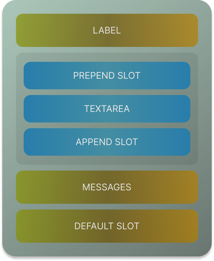
| label | string | false | An optional label for the input field. If provided, it is displayed as a field label. |
| placeholder | string | false | An optional placeholder for the input field. It is displayed inside the input when no value is present. |
| disabled | boolean | false | Determines if the input field is disabled. Defaults to false. |
| required | boolean | false | Determines if the input field is required. Defaults to false. |
| readonly | boolean | false | Determines if the input field is read-only. Defaults to false. |
| contentProps | object | false | Additional props to pass to the contenteditable element, such as attributes like custom data attributes. |
Slots
| Name | Description |
|---|---|
| default | Slot for rendering additional content or components inside the input container, below the input field. |
| prepend | Slot for rendering content or components before the input field, such as an icon or label. |
| append | Slot for rendering content or components after the input field, such as an action button or icon. |
Usage:
If your field has array of values then you can use the name like:
Class Naming Style
- Base Class: The base class for this component is
vf-field. It acts as the primary identifier for the component and provides a foundation for additional styles. - Modifier Classes: These classes modify the appearance or behavior of the base component:
vf-content-editable-field: Applied to indicate the component is a content-editable field.vf-field--error: Added when the formik validation detects a field error.vf-field--disabled: Added when the field is in a disabled state.vf-field--readonly: Applied when the field is set to read-only.
- Input Element Classes: Classes specific to the
divacting as the content-editable input:vf-input--error: Indicates an error in the input field.vf-input--placeholder: Used when the input is empty and the placeholder is visible.vf-input--disabled: Marks the input as disabled.vf-input--readonly: Marks the input as read-only.
- Error Message Class:
vf--error: Used for displaying error messages below the input field.
- Dynamic Behavior: Classes are applied conditionally based on the component's props and state:
- Error-related classes depend on
formik.hasFieldError(name). - Placeholder-related classes depend on
!hasValue. - Disabled and read-only classes depend on the
disabledandreadonlyprops.
- Error-related classes depend on