FormSelectField component
The FormSelectField component is a reusable select field designed for integration with useFormik composable. It handles field value updates, validation errors, and accessibility attributes automatically. With support for customization through props, it ensures consistent styling and behavior across forms while simplifying form logic.
Props:
| Name | Type | Required | Description |
|---|---|---|---|
| formik | object | false | The Formik instance manages form state, validation, and field values. Using Vue’s provide/inject, the Formik instance can be passed to child components. If no props are provided, the component searches for a parent Formik instance and throws an error if none is found. |
| name | string | true | The name of the form field, used to identify the field in the Formik instance. |
| label | string | false | An optional label for the input field. If provided, it is displayed as a field label. |
| placeholder | string | false | An optional placeholder for the input field. It is displayed inside the input when no value is present. |
| options | Array<{ label: string; value: string | number }> | false | An array of objects representing the selectable options. Each object should have a 'label' and 'value' property. |
| disabled | boolean | false | Determines if the input field is disabled. Defaults to false. |
| required | boolean | false | Determines if the input field is required. Defaults to false. |
| readonly | boolean | false | Determines if the input field is read-only. Defaults to false. |
| inputProps | object | false | Additional props to pass to the input field, such as attributes like data attributes, etc. |
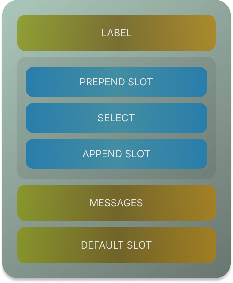
Slots
| Name | Description |
|---|---|
| default | Slot for rendering additional content or components inside the input container, below the input field. |
| prepend | Slot for rendering content or components before the input field, such as an icon or label. |
| append | Slot for rendering content or components after the input field, such as an action button or icon. |
Usage:
If your field has array of values then you can use the name like:
Class Naming Style
- Base Classes: The foundational classes for this component are:
vf-field: The primary class for styling the field container.vf-select-field: A base-specific class indicating the field is a select input.
- Input Wrapper Class: The
vf-inputclass is applied to the wrapper element surrounding theselectinput. It serves as the container for the select element and optional prepend/append slots. - Dynamic Classes: Classes applied conditionally based on the component's state and props:
vf-field--error: Applied when the field has a validation error, determined byformik.hasFieldError(name).vf-input--error: Applied to theselectelement whenformik.hasFieldError(name)is true, indicating an error in the field.vf-input--disabled: Applied to theselectelement when thedisabledprop is true, marking the field as disabled.